|
Throughout the past couple of months, Art 4 has helped me to expand my range of mediums and explore my creativity and imagination more. When I first started on the Prismacolor piece I remember being intimidated by my lack of knowledge about Prismacolor; however, over the course of that project I was not only able to understand how Prismacolor behave but also what the pros and cons of Prisma colors were. I quickly learned how well the colors blend due to their pigment, but I also learned that Prismacolor pieces take time to do.
Similarly, over the last few pieces, I was really encouraged to push myself when brainstorming ideas. I tried to move out of my comfort zone and explore other mediums and more complex ideas. The interior spaces project was one such example of this. Doing a multimedia piece was something I had never done before. However, it was one of my most enjoyable pieces to do. I was so used to doing acrylic pieces that incorporating magazine clippings and gesso was different. The final product was so unique since there was so much contrast in the piece between the textures and colors I used. One of the last influential things I've learned from Art 4 is that a strong, supportive community is important. I always used to get hung up on the things I didn't like about of a piece instead of seeing the things I was proud of. I think peer critiquing helped with this. It helped me to hear that others also agreed with the strengths and weaknesses of my pieces. The community this class has offered me as been amazing in sharing ideas, expressing problems, or feeling more inspired. Art 4 has been a helpful class to me, and I feel more prepared going into AP Art and my concentration.
0 Comments
This is by far my favorite piece I have done in this class. I didn't think I would enjoy using the palette knife as much as I did. I was nervous that the palette knife would not allow me to properly show the details in the picture. However, since there were a lot of different textures in the pieces, such as the rocks, road and grass, it works out well for me. The palette knife allowed me to use any imperfections to my benefit. I had a lot of fun using different size palette knives to achieve different textures and shapes.
I chose this picture for my landscape because I really liked the composition. The way the road curved added a lot of depth to the picture especially with all the big rocks in the background. I really like the final result of the painting. I think my color sections helped to emphasis the contrast as well. I used a lot of colors I normally wouldn’t use in my palette. For example, I used pink in the rocks and purples in the road. The oil paint was very vibrant which helped to make the rocks to stand out. If I could change anything about this painting, I would add more highlights in the rocks. Even though, I have some highlights I feel like more whites and yellows might have helped to bring more depth to the rocks. Even though this was my first palette knife painting I really enjoyed going out of comfort zone and embracing the imperfections of the painting. This project was hard but fun to plan for. When I first started coming up with ideas for this project, I had a hard time coming up with creative ideas that were interesting to me. I ended up making a list of twenty ideas and ended up picking a completely different idea. The idea I picked was taking the solar system and putting it in a puppet show background. It was to highlight the influence of people on our society. In this painting, I wanted the universe to seem to be in the control of a mysterious force. The whole idea behind the puppet show was to illustrate how it's so easy to allow other forces, things or people to affect your life.
I really enjoyed doing this piece, I had a lot of fun with it. It was also really interesting to dive deeper into each planet and learn about them! Planets have always fascinated me so I hope to do more pieces highlighting them in the future. I particularly enjoyed doing the curtains, I like how the texture of the curtains ended up. Getting the placement of the planets in the right place was quite a challenge because I had to use transfer paper on my canvas since pencil wouldn't show up. However, the transfer paper wouldn't come off so I ended up having to paint over it. I felt creativley inspired during this project. I wish I had planned out how to paint the solar system better before using tranfer paper but I learned my lesson for next time. Using oil paint for this project also brightened up my planets and gave my painting more contrast. This painting was quite the process but I am happy with the result in the end.
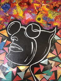
I had a lot of fun with using my creativity in this project. When I was first told the topic for this project, I had trouble coming up with 20 ideas. I was able to come up with ideas from real life easily such as "Inside a chip bag" or "Inside a jewelry box." The abstract concepts and ideas were harder to think of, but it led to one of my favorite ideas, "Inside a dream." I decided I wanted to pursue that idea and proceeded to do some compositional sketches and get some inspiration online. I did a lot of "research" before I began to do this project so that I knew exactly what I wanted to do.
I decided I wanted to do a line drawing of the face and do collage and paint around the face for contrast. I really enjoyed drawing the face and playing around with the shape and it was particularly interesting because I drew it with one line! For the collage, I knew I wanted to do triangles in order to contrast the curve lines of the face. Since I decided to do the triangles on the bottom half of the painting, I want sure how I wanted to represent the dream aspect of the piece. I settled on doing paint and collage to get cohesiveness between the top and bottom while tying in the paint aspect of the background. Overall, I really liked this piece. It was very different for me and out of my comfort zone, but I had a lot of fun and was able to be creative. The contrast in the painting was probably my favorite part. I also enjoyed doing the face and playing around with different shapes and angles to get the desired effect. Using gel medium to seal the magazine cutouts were a new and different experience as well. Blending the magazine cutouts into the paint was important to me in order to try to hide some of the cutouts. I wanted the viewer to see something new and different every time they look at the piece.
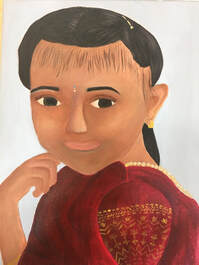
This self-portrait was a challenge for me, but I think I learned a lot during the process. I picked a picture from my childhood and in this particular picture I was wearing traditional ethnic wear. In hindsight, I probably should have picked a more straightforward picture but I'm happy with the way my piece turned out in the end. I started the painting by doing some initial practice sketches and emphasizing my practice on the eyes and nose, the two features I have the most trouble with. After I did an initial sketch on the canvas, I did an underpainting with some watered-down burnt sienna. I used the opacity of the paint to dictate the light and darks of the painting. When I actually began painting, I had a lot of trouble matching colors for the extreme lights and darks in the picture. I think the color of the skin color was pretty close. The ear and hand were simpler in terms of using shadows to show the depth. The hardest part of this painting though was the hair. My hair is jet black and in the picture the light reflecting on my hair looks white. It was really hard for me to figure out how to make my hair look textured and slicked back without using white or grey. I ended up using light brown, dark browns and I put some dark red and lavender below those. For the shirt, I ended up doing just a red shirt because I thought the checkered pattern was going to be more elaborate and I wanted a plain shirt. I decided to do a red shirt since the sleeve of the shirt was red. The shirt is probably my favorite part because I think I did a nice job showing the folds of the shirt. Overall, this is not my favorite painting. I still think there is improvement to be made with painting portraits for me. I feel content that I put all my effort into this painting. If I were to do this project again there would be things that I would do differently. The biggest change I would make is really intensifying the lights and darks. I also think I might have preferred this piece in oil since the paint remains wet longer. I hope to try to do more portraits in the future.
This project was a quite a journey for me. This was my first time using prismacolors as well as my first time doing a Prismacolor piece. There was quite a learning curve to this project; however, this project made me want to explore prismacolors more and get better at color development. Over the years, I have gotten used to mixing paint, but layering colors is a new skill to me. As I began this project, I had two main ideas, cookies and baseball hats. Both of these items being things I use in my everyday life. I took compositional photos and decided I liked the cookies more due to the position and angles I was able to achieve. Cookies are my favorite food, and baking tollhouse cookies is my favorite thing to do on weekends. Although, Costco Cookies are my all-time favorite cookies, for this project, I used Chips Ahoy Original Cookies. Going into this project, the intimidating part was being able to replicate the rough and crumbly texture of the cookies. I was pretty nervous to begin this piece because it was a new medium to me. I began with a very light hand and light colors until I grew comfortable enough to start layering colors. It took me a total of 10 days to finish this piece.
This piece helped me learn how to layer colors. I started noticing the undertones of colors in order to better achieve the color I was going for. For example, In the cookies I used a beige Prismacolor with a green undertone (it's the color Ginger Root), this helped the oranges and yellows I later layered to blend seamlessly into the beige-heavy background. This project was intimidating to start, mostly because of the size of the canvas and the amount of layer I would have to build up; however, as I got started it wasn't as bad. Overall, this piece is not my favorite, but I also don't hate it. For my first my Prismacolor piece, I think it could have been a lot worse. Even though I won't be hanging this piece up in my home, I think I got the colors down pretty well. I also think the reflection in the table is pretty well done. The cookies are definitely my least favorite part. Recreating the texture became the biggest challenge. I tried my best but I think I made some mistakes early on in the process which also limited how much texture I was able to show. I should have defined the texture more in the beginning as well as allocating certain areas for the darker colors, instead of layers white and yellows in those areas first. Although there are plenty of things I could have done differently, I hope to get better at Prismacolors and do more pieces with them! Today, I drew a pumpkin with prismacolors. It was my first time working with prismacolors and it was a rocky start. I began by sketching out an outline. When I first began coloring it in with colors, I went in with a heavy hand. I quickly learnt that prismacolors perform better when it is layered in thin coats. I also learnt I have to start with the lightest colors and work my way up to the darkest. Overall, I like my pumpkin and think it turned out nice for my first prismacolor piece!
|