0 Comments
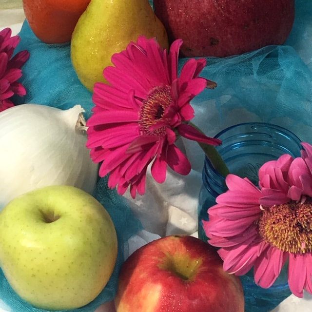
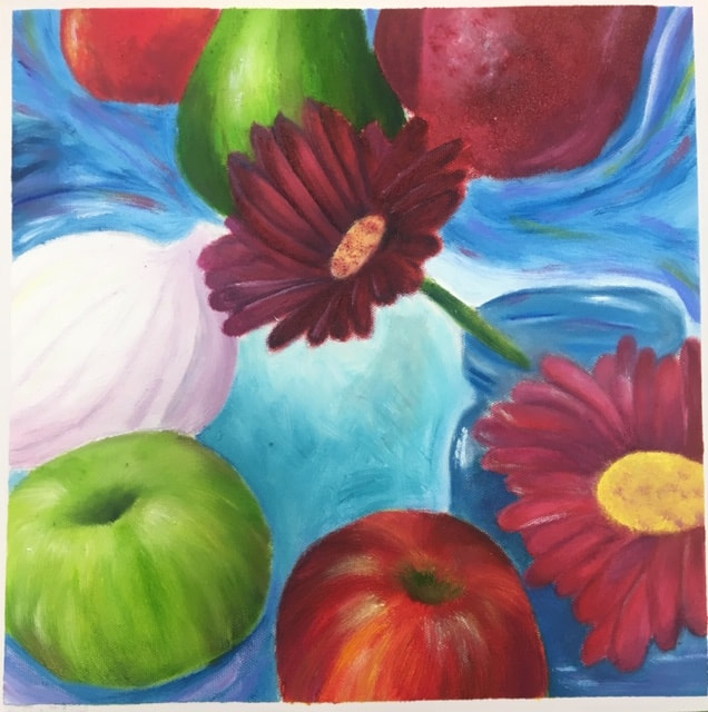
This oil painting is of a picture I took of the set-up Ms. Rossi made. I used a grid app to help me sketch out the image on the canvas. I then started working from the background to the foreground. It was challenging to individualize all the petals on the flowers but overall, I had fun doing this painting and I like the overall result of it.
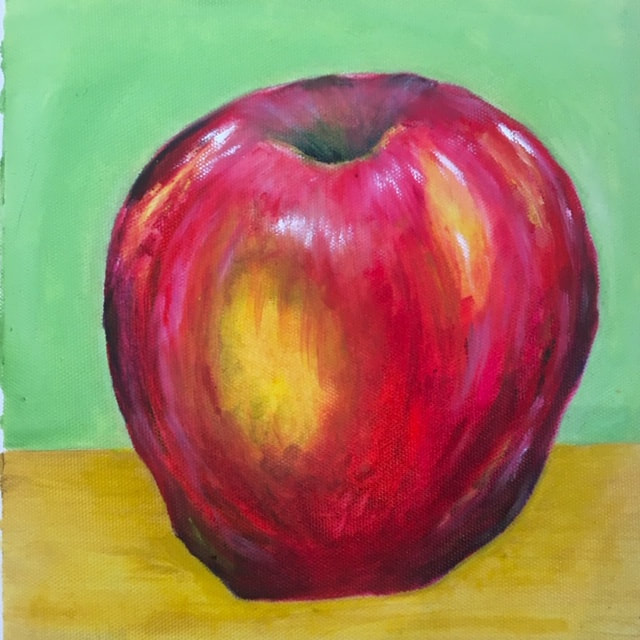
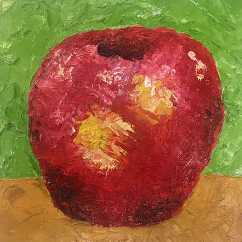
These pictures are of my oil painting apples. The one on the left was with a brush and the one on the right was done with a palette knife. I personally liked using the brush better because all of my previous oil painting were made with a brush. The palette knife took some getting used to but I got the hang of it eventually. I think my apple with the brush is a lot more realistic than the palette knife one, but I still like the abstract look that was achieved with the palette knife.
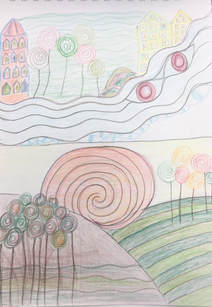
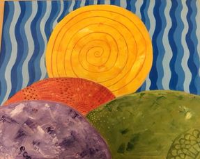
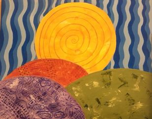
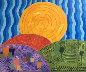
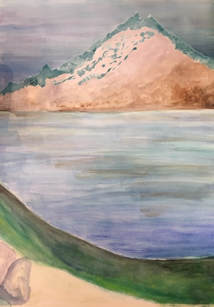
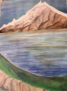
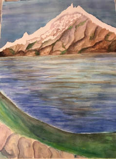
1. I believe this painting is neat and well executed. Although it was difficult for me to paint the wavy lines and the designs while maintaining clean concise lines, I was able to learn which brushed to use. I personally think I was eventually able to get pretty clean lines. I like the composition of my painting and the different regions. The use of color was extremely important to show the difference between the cityscape, trees and desert.
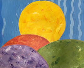
2. My work embodies Hundertwasser's style through the opaque colors and designs. Although my designs aren't quite as opaque I wanted, I really wanted the trees and houses to stand out. The style of trees and houses also embodies Hundertwasser's work. I used a lot of curvy lines and spirals as well and really tried to restrict myself from using straight lines. 3. My choice of color had to do with the region of the world I was depicting. I tried to use bright, bold colors to really stand out. The orange for the desert and the green for the forest was predetermined as well as the yellow sun and the blue sky, but the color for the background of the city took me a while to come up with. I first started with a light pink but it looked unnatural and it didn't work with the other colors. I then used a light lavender which i thought contrasted the other colors perfectly. For the colors of the houses and the trees I just wanted really bright bold colors. 4. The focal point of my artwork is the sun. The sun was supposed to emulate a sunset and the overwhelming size is supposed to be with your eye is drawn too. I wanted the sun to be a symbol of unity for all the different parts and regions of the world. I also wanted the sun to be "overlooking" the other regions. 5. I used textures and designs to embellish my artwork by incorporating them into the background. I created wavy lines for the sky, swirls in the sun and a variety of different designs in the different regions.It helped add interest to the piece as well as highlight the different regions. The designs were out of my comfort zone but I had a lot of fun creating them and playing with the composition. 6. I didn't put a border on my final artwork but I did in some of my compositional sketches. Borders really help emphasize the painting or sketches. I personally didn't think a border would look good on my painting because my landscape already had a lot going on. I also didn't think any of my border ideas would complement my painting perfectly so I decided not to have a border. 7. I had difficulties creating the trees and buildings. I tried my best but it was really difficult for me to emulate Hundertwasser's style when it came to this. Personally, I don't like the lollipop trees and the buildings as much as I thought I would. The wavy lines in the sky also gave me some trouble, but I was eventually happy with it.
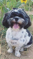
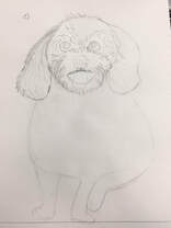
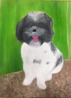
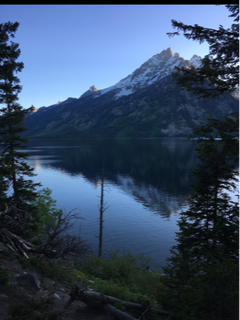
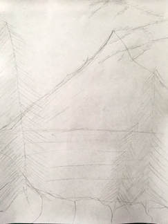
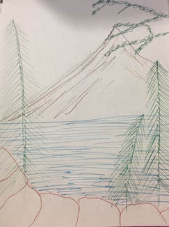
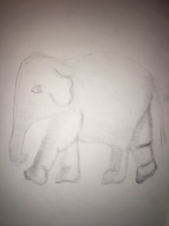
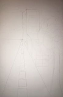
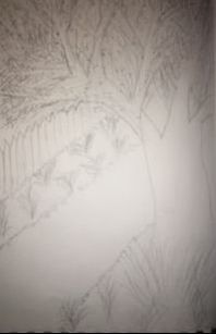
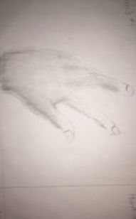
We had to draw four different things: a hand, an animal, a tree in a landscape, and a street scene. I didn't use any references for my drawings, which I am regretting. I'm not very happy with how they turned out.
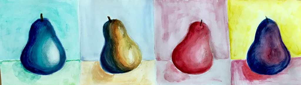 For my series I used four different techniques:
1) cool colors 2) complementary colors 3) monochromatic 4) water color colored pencils My favorite was the complementary colors because I enjoyed working with two different colors. My least favorite was the colored pencil. I had a little trouble showing the light and shading. 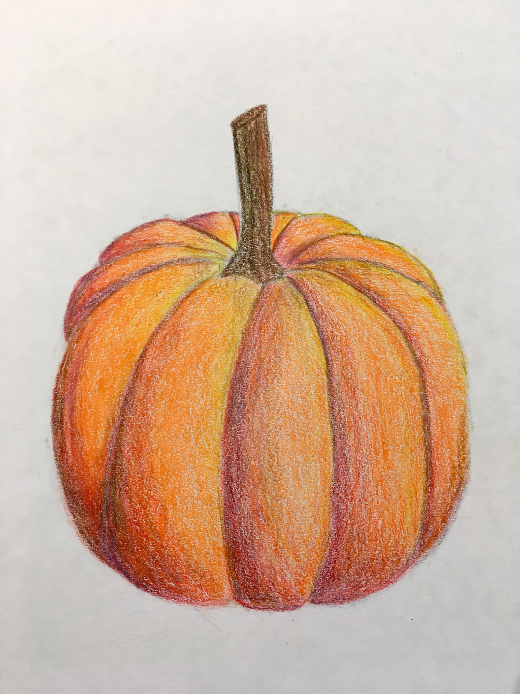 I used prisma colored pencils to draw this pumpkin. I used monochromatic colors and then used complementary colors to deepen the shadows.
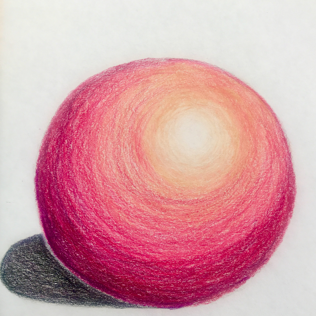 I used prisma colored pencils to draw and shade this sphere. I used monochromatic colors to represent the light source and the shadows.
|